SITE_TITLE
J.League A Common Ground for Every Color.
Our Brand
For over 30 years,
J.League has inspired pride
in communities across Japan,
growing from 10 clubs
in 1993 to 60 today.
Now, united in diversity,
we are taking our boldest step yet:
to shape our future
as a world-class league.
The J.League brand is
evolving alongside us.
Turning the stories and passion
we have built together into strength,
we will grow into a beautiful,
powerful brand felt around the globe.
Design Concept
Common
Ground
Every Color Shines Here.
The pride of the clubs,
the heartbeat of its players,
and the passion of fans.
J.League is the common ground where
everyone finds a place to shine.
Black and white hold every color,
drawing out the uniqueness of each.
Together, they embody a distinctly
Japanese aesthetic
of light and shadow.
From this place,
a foundation that
supports and elevates all,
the J.League brand will keep evolving.
Logo
J.League
Symbol
At the center of the symbol is
a white circle representing a football,
and a red circle inspired by the Japanese flag.
Preserved since the J.League's founding in 1991,
our symbol takes the form of the letter J,
expressing Japan's premier professional football
league
through a bold and timeless design.
Graphic Element
Flare
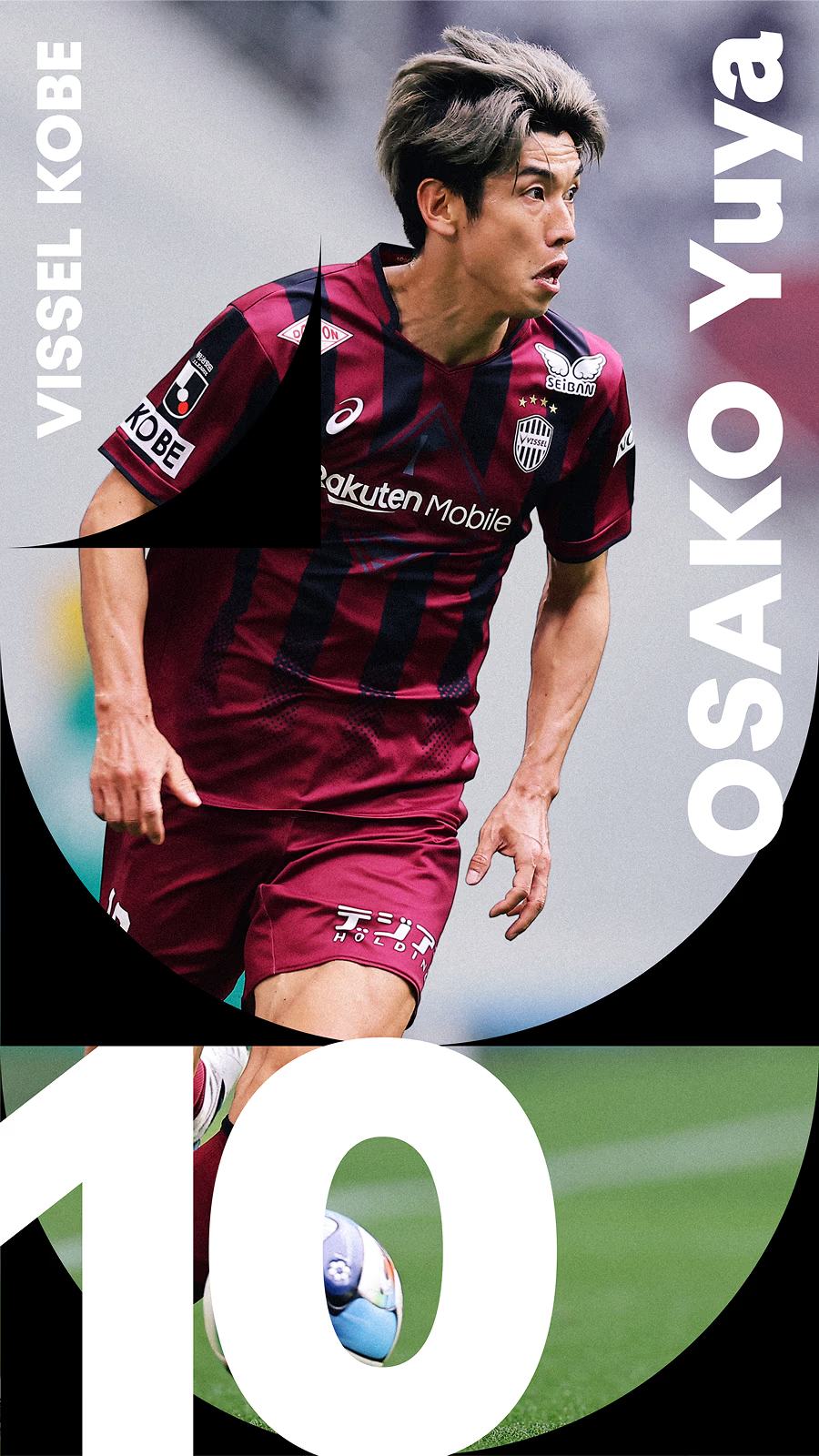
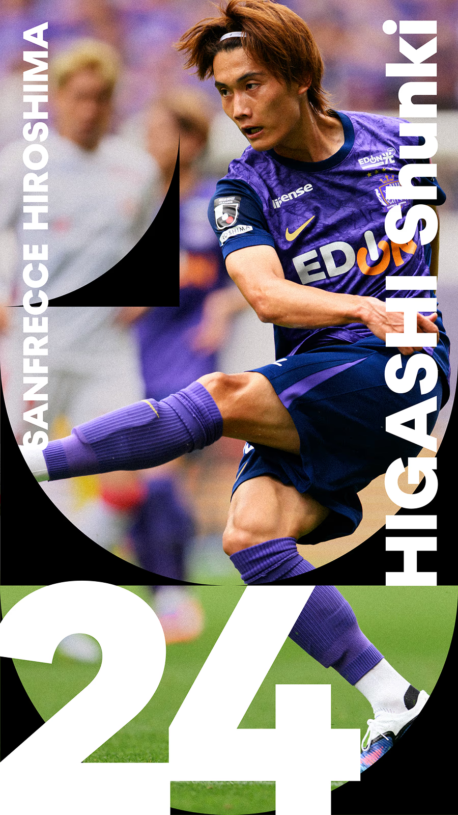
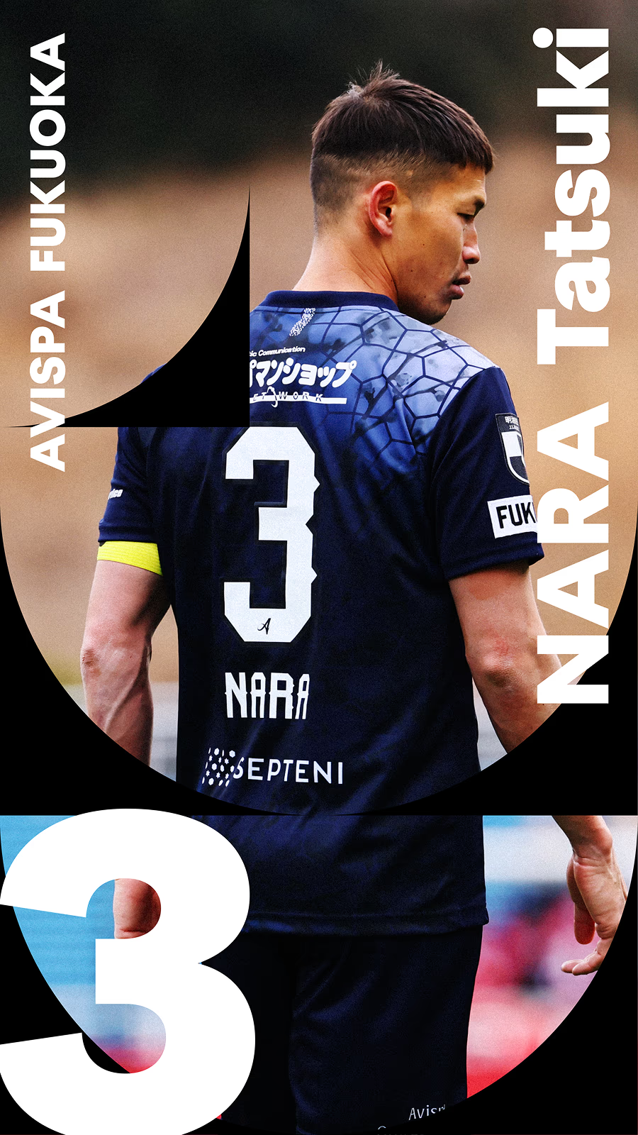
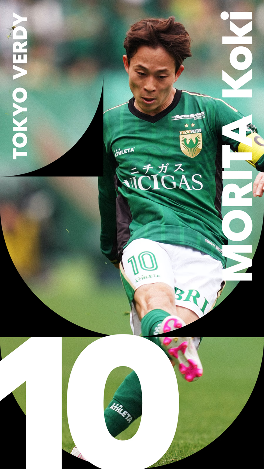
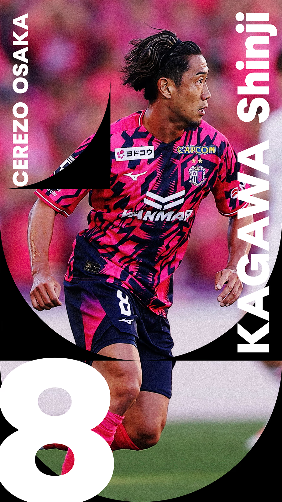
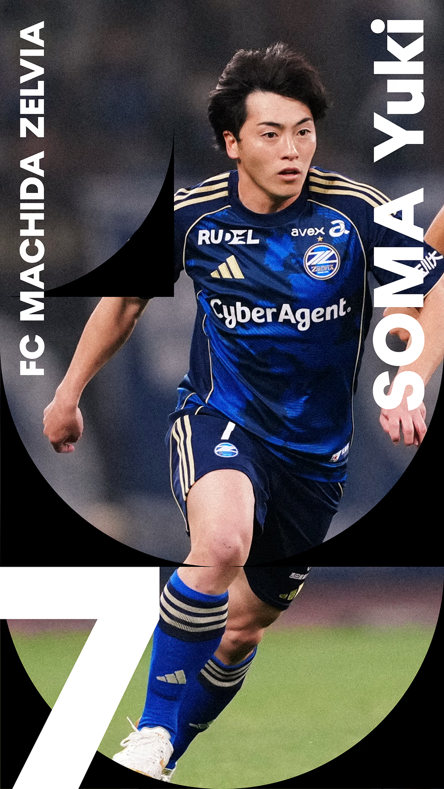
Flare is a newly developed graphic element
inspired by the trajectory
of a football in motion
and the energy rising from the pitch.
Based on the curved and straight lines
that form the J.League symbol,
its sharp, ascending arc brings
powerful movement and direction to the design,
expressing the league's progressive spirit and
energy.
Color
League and
Club Colors
Black and white embrace every color,
yet allow each to stand out.
These league colors form a foundation for
all 60 club colors to shine with exceptional
brilliance.
The gradation between these two colors
captures
Japan's distinctive aesthetic
of light and shadow,
as well as the league's dynamic energy.
With this foundation, J.League continues to
illuminate every color that emerges.
-

-
-
-
-
-
-
-
-
-
-
-
-
-
-
-
-
-
-
-
From 10 founding clubs to 60 today,each color
carries its own story.
We are a stage where every color, every story—
even those yet to unfold—shines bright.
Typography
J.League Sans
Sharp yet graceful strokes,
like a football kicked high into the air.
Every detail of J.League Sans is designed
to embody the dynamic energy of football,
while pairing naturally
with our Japanese typefaces.
Guidelines
J.League
Brand Guide
We unite the guiding principles
that run through all J.League creative
and share them openly with all.
A brand that never stops evolving,
yet maintains an unwavering core.
This guide, too, will continue to
grow alongside the league.
Applications
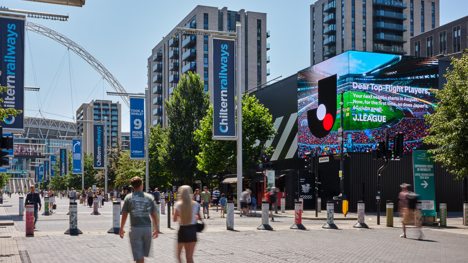
J.League
in Action
When every element unfolds
in alignment with our guiding principles,
graphics infused with unity and energy
will transcend media
to convey J.League's passion to the world.
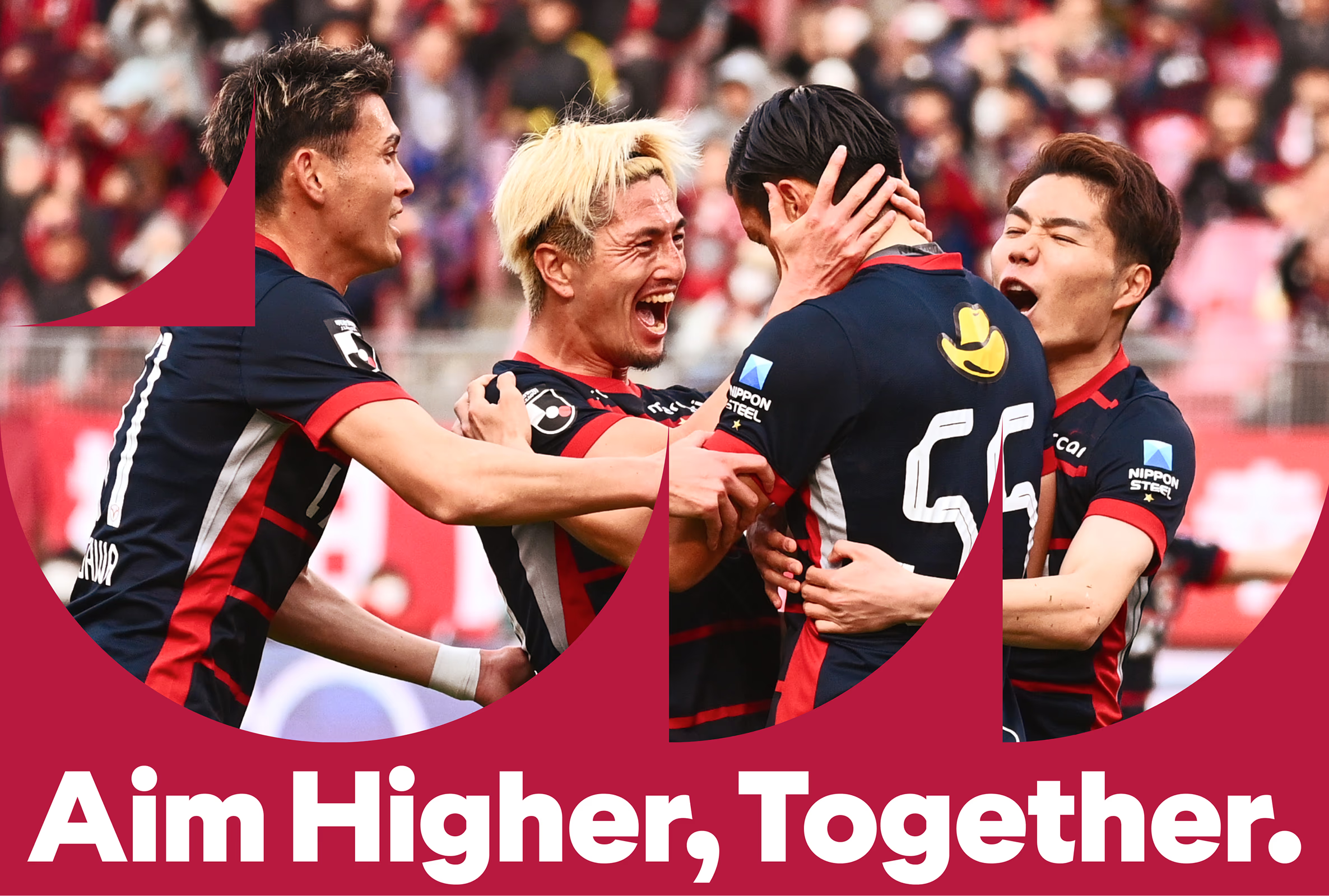
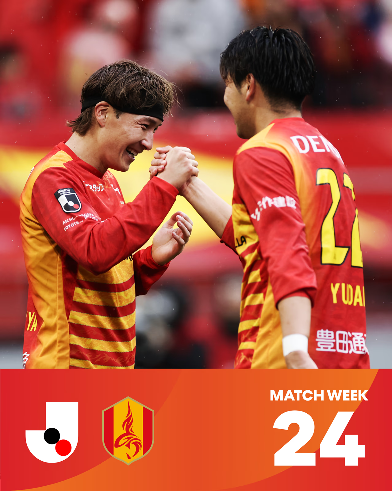
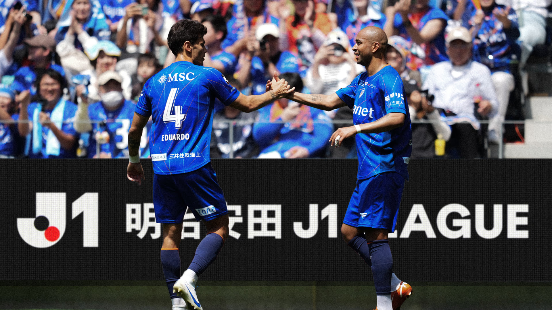
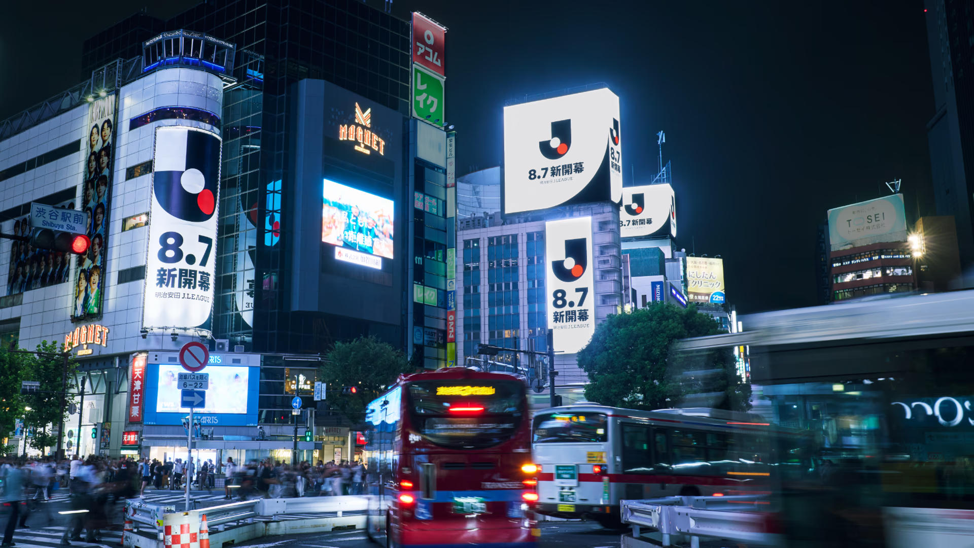
This establishes the league's distinctive presence.